.png)
Role:
Product Designer
Timeline:
2026
Team:
Sr Product Designer | Product Owner
Status:

Project Overview
Context
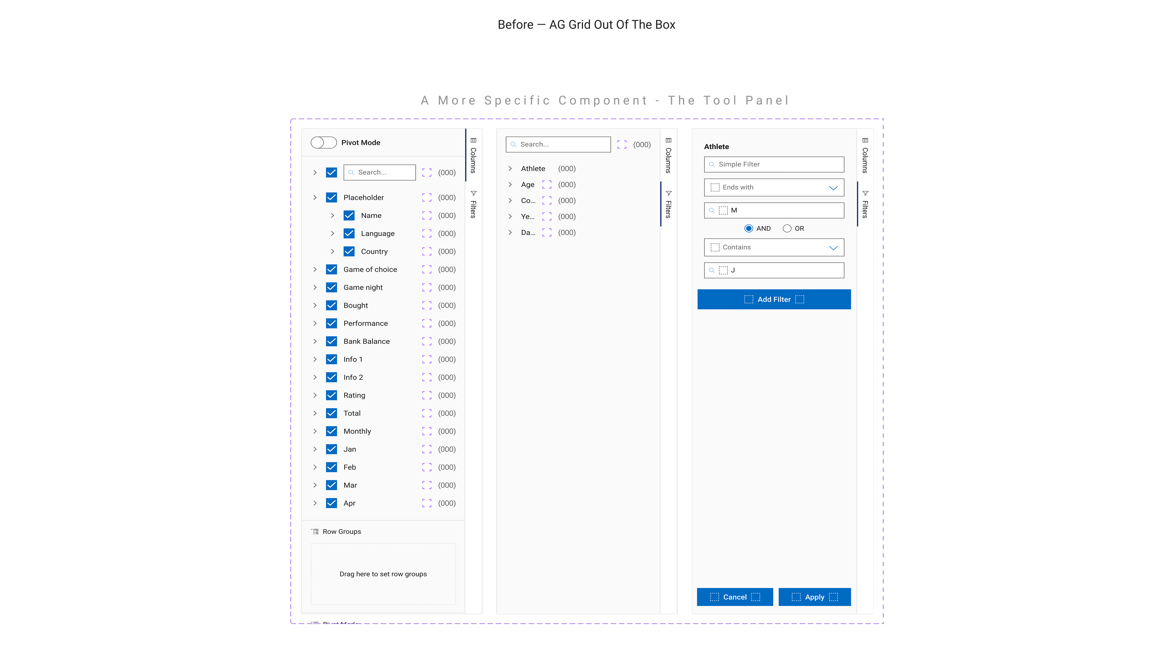
When I joined the Portfolio Management Re-imagine (PMR) program at RBC Wealth Management, the goal was clear: unify a fragmented set of advisor tools into a single, modern experience. The first product was APT, the Advisor Presentation Tool, a data-heavy platform where advisors generate reports, analyze portfolios, and prepare client-facing materials. It replaced multiple disconnected tools, but introduced a new layer of complexity: dense, highly interactive data tables. Engineering chose AG Grid to power this experience, a strong technical decision. But from a design perspective, it exposed a critical gap.
AG Grid had never been used within Wealth Management before. There was no design language for it. No components, no documentation, no accessibility guidance, and no alignment with existing design tokens. If left unaddressed, APT would ship with a UI that felt disconnected from the broader ecosystem and future teams would each solve the same problem differently. As the sole designer on the project, I wasn’t just designing a feature. I was defining a foundation that didn’t exist yet.
The Work
I started by reframing the problem. This wasn’t just about styling a data grid for APT, it was about preventing inconsistency across an entire program. So instead of designing a one-off solution, I set out to build a scalable system. The first step was understanding AG Grid at a technical level. Its theming system is built on CSS variables, which meant I could map Wealth Management’s design tokens directly into the grid without breaking its functionality. That became the bridge between a third-party library and our internal design system.
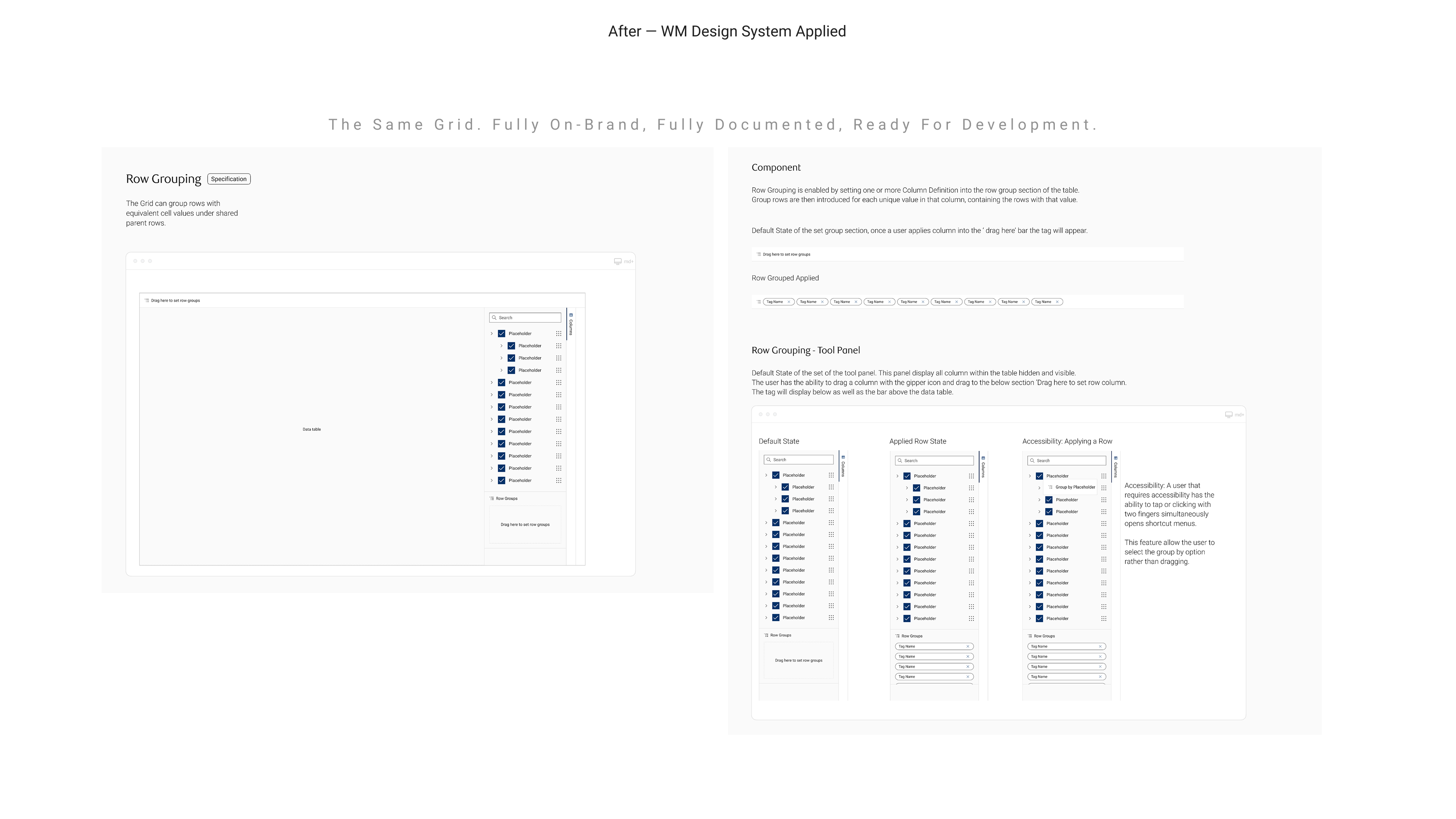
From there, I mapped the full surface area of the component, not just what APT needed immediately, but everything required for a production-ready grid: row states, sorting, filtering, grouping, hierarchical data, tool panels, and more. Designing for completeness upfront prevented gaps later. The visual work focused on making AG Grid feel native. I replaced its default styling with Wealth Management’s tokens, typography, spacing, and colours, so the grid integrated seamlessly into the ecosystem rather than feeling like an embedded tool.
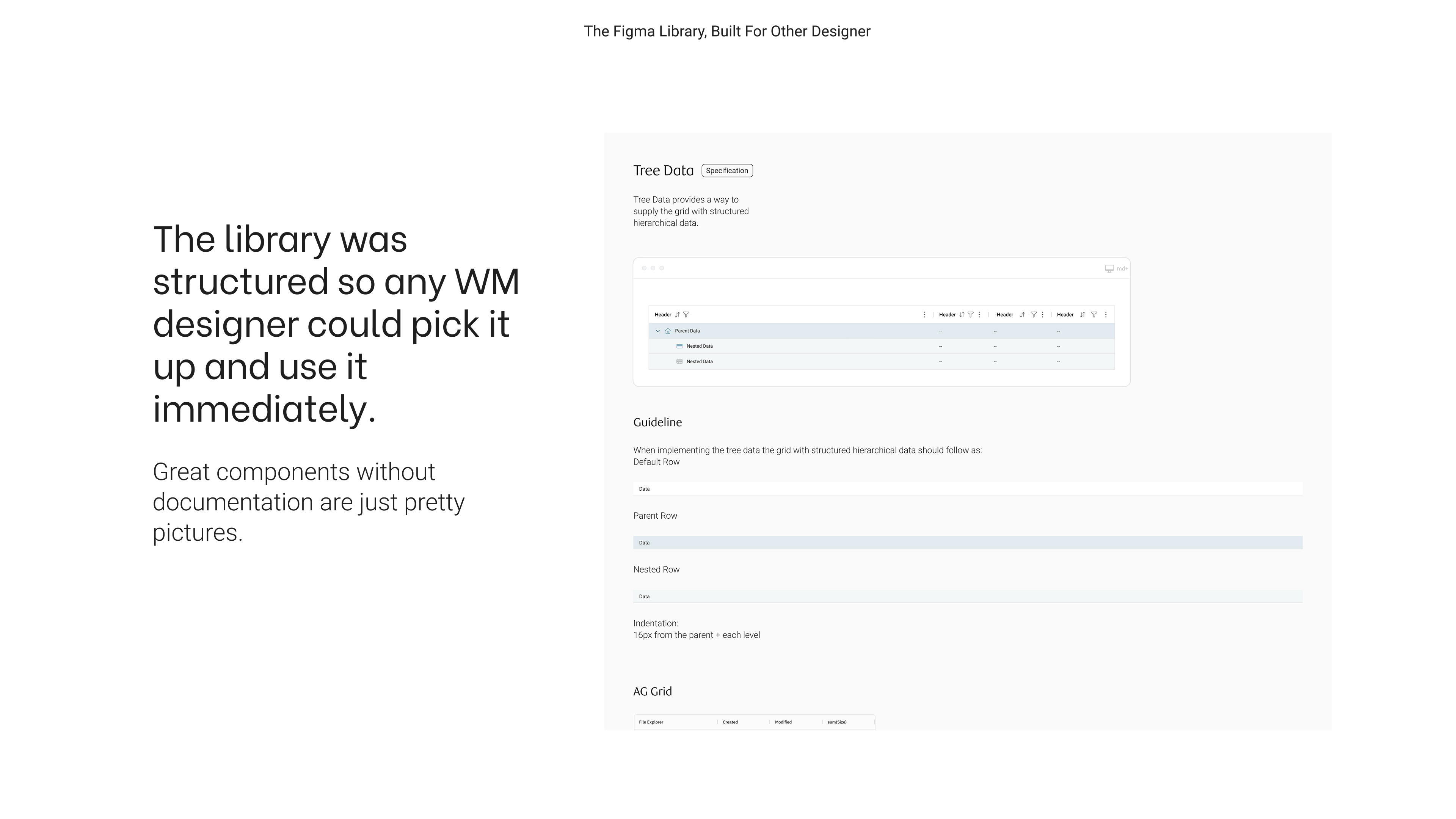
In Figma, I built components for reuse, not presentation. Every element was structured with variants and properties, allowing other designers to quickly assemble complex tables without starting from scratch. I designed with the next user in mind, someone new to the system, working under time pressure, needing clarity without explanation. One of the more complex challenges was hierarchical data. I designed a clear structure for nested relationships such as households and portfolios with consistent indentation, distinct parent states, and intuitive expand/collapse behaviour. Just as importantly, I documented when and why to use these patterns, not just how they looked.
Accessibility became a key focus in interaction design. For example, row grouping in AG Grid relies on drag-and-drop, an interaction that excludes some users. I introduced an alternative method that allowed grouping through selection instead. Both interaction paths were documented equally, reinforcing that accessibility was not an enhancement, but a requirement.
To ensure adoption, I treated documentation as part of the design itself. Each component included clear usage guidelines, visual specifications, and live examples tied to real implementation. I also created a Getting Started guide with multiple entry points, supporting designers, developers, and teams with different needs and levels of familiarity. The goal was simple: anyone should be able to use the system on day one without needing to ask how.

Final Outcome
Conclusion
The AG Grid design system is now actively used in APT, which is currently in development. The shift from default AG Grid styling to a fully integrated Wealth Management experience is immediately visible, transforming a generic data tool into a cohesive product. More importantly, the system extends beyond APT. It now serves as a shared foundation for teams across PMR and Wealth Management. Designers and developers no longer need to reinvent patterns or make isolated decisions. They have a consistent, documented starting point that aligns with the broader ecosystem. This reduced the risk of design fragmentation early, before it had a chance to compound. What started as a gap in a single project became an opportunity to remove that gap entirely for every team that follows.
What I Learned
This project shifted how I think about design. Designing for other designers and developers required a different kind of empathy, anticipating needs rather than observing them. It pushed me to think about clarity, speed, and usability at a system level. I also learned that documentation is not secondary to design, it is design. The quality of a system is reflected as much in how it’s explained as in how it looks.
Most importantly, it reinforced that adoption is the true measure of success. A system only works if people can and want to use it. Designing for that reality changed how I approached every decision, from structure to onboarding.


