.png)
Role:
Product Designer
Timeline:
2026
Team:
Product Owner | Developers | Accessibility Specialists | Design Director | Head of Design | Brand Director | Design Intern
Status:
Project Overview
The Question That Broke Everything Open
When we started designing report outputs for the Advisor Presentation Tool (APT), a simple question broke everything open: What happens when you print?
Advisors needed reports that worked both digitally and in print, the same content, consumed two different ways. So I tested our designs. I hit print. And everything scattered.
Charts broke across pages. Tables split mid-row. Content that should have stayed together landed on different sheets. The story fell apart. Advisors had no visibility into where page breaks would occur because the online experience appeared as one continuous document. When printed, the carefully designed flow meant nothing.
That's when I realized we didn't have standards for this at all. We were using collateral guidelines from 2019.
Instead of just fixing one report, I asked myself a different question: What if I built a system that could work for all of them? That pivot changed everything about how I approached the problem.

The Real Problem Wasn't the Report
The deeper I dug, the worse it got.
Print behaviour was broken but that was just the symptom. Accessibility was an afterthought, with no real structure for assistive technologies or document hierarchy. Those were problems too.
But the real issue ran deeper.
I was working with two product designers, and we were all making different decisions. Meanwhile, the business supported multiple lines, Dominion Securities, Royal Trust, PH&N, Family Office Services, WMFS. Each had different reporting requirements. And when I audited what existed, I discovered that every business line was interpreting RBC brand standards differently. Designers made different calls. Developers had no source of truth. Inconsistency wasn't a bug; it was baked into the system.
I had a choice: design one report really well, or fix the system so future teams could design many reports consistently.
I chose the system.
Learning Print (And Everything Else)
To even understand what I was fixing, I had to learn print. And I didn't know much.
I sat down with Product and Engineering partners and asked basic questions: How do reports actually print? What breaks? What holds? I learned that reports would be generated using sRGB rather than CMYK meaning colours would never appear exactly the same in print as they did on screen. I learned that reports could be printed professionally through Symcor or casually by advisors using office printers, introducing additional variability into the final output. Each pathway had different constraints.
I talked with accessibility specialists. They walked me through how document structure matters more than visual design, how reading order, heading hierarchy, and semantic markup serve people using assistive technology. It shifted how I thought about the work.
Then I audited everything. Existing reports. Brand collateral. The Design System. That 2019 collateral standard. I compared how different teams used typography, colours, charts, tables, and branding elements.
What I found was devastating in its clarity: inconsistency everywhere. Different teams interpreted typography standards differently. Chart colours varied wildly across products. There was no single source of truth. No one was making bad decisions, they were all making different decisions because they had no shared framework to reference.
That's when it clicked. I wasn't designing reports. I was designing the system that future teams would use to design reports. That reframing made the scope clear and the stakes concrete: this framework could either enable consistency at scale, or we'd keep reinventing the wheel for every new report.
The Strategy: Build the Building Blocks
My strategy was deliberate: Define standards for every recurring component. Typography. Layout and spacing. Cover pages and disclaimers. Charts and data tables. Accessibility requirements. Print behavior. Edge case handling.
By standardizing the building blocks, future teams could move faster while maintaining consistency. That was the leverage point. One framework, infinite reports.
But standardizing meant making choices. And those choices revealed the tensions embedded in the work.
Where I Hit My First Real Conflict
The typography decision forced me to name the real constraint.
My audit showed chaos. Some teams used RBC Display for everything, it's the brand typeface, so it felt right. Others mixed RBC Display and Roboto depending on context. I needed alignment, but stakeholders disagreed.
Some wanted RBC Display everywhere. Brand consistency. Visual authority. I understood the argument.
The design team pushed back differently: RBC Display is beautiful at 28px. At 14px, it gets hard to read. They weren't being precious about aesthetics, they were worried about usability. About accessibility. About whether the type would serve the advisors and clients reading these reports.
What I realized was that this wasn't a design preference. It was a constraint problem. RBC Display works at scale. Roboto works at detail. Both serve a real purpose. The tension was real because both sides were right.
My decision: RBC Display for headings 22px and above. Roboto for smaller headings and body content. Both maintained brand identity. Both respected readability and accessibility. Neither side got everything they wanted, which is how I knew the solution was actually balanced.
That taught me something important: The best solutions don't eliminate tension, they respect the constraints on both sides.

Building a System for Complexity
The next challenge arrived as an expansion request.
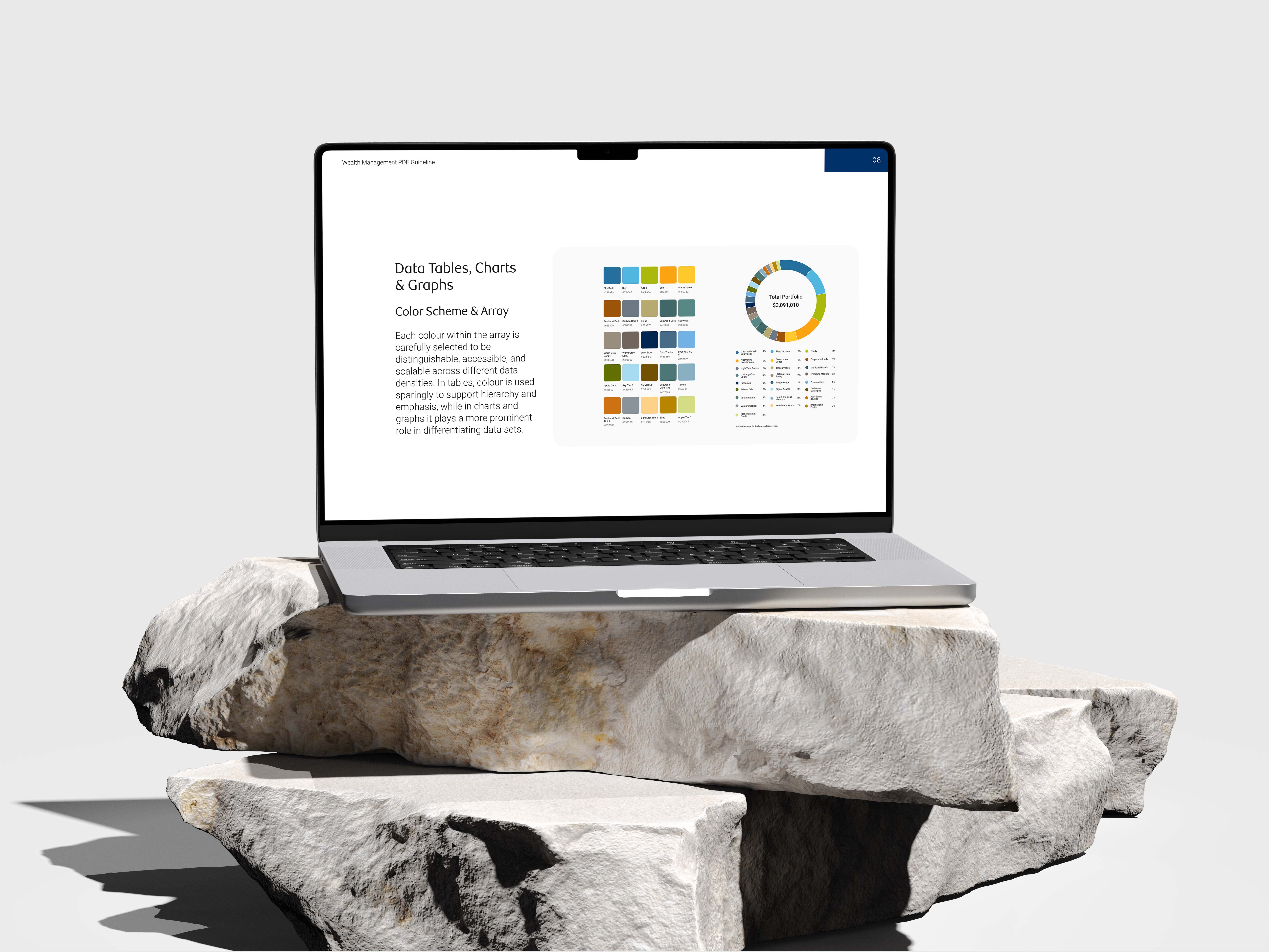
The business initially asked for a chart colour palette supporting 13 data points. During a review meeting, that requirement jumped to 25 simultaneously. I could have interpreted that as a simple palette problem, just pick 25 colours that differentiate well.
But I knew that wasn't the real problem. The real problem was: How do you show 25 data points clearly? How do you maintain visual differentiation when there's no natural limit to your data? This was a visualization system challenge, not a colour exercise.
I explored multiple directions using both the RBC Design System and Wealth Management branding as references. I tested them against real data scenarios. I presented concepts to Design Leadership and gathered feedback on what worked and what didn't.
Then I partnered with a design intern and we expanded the system together, not just creating a fixed set of colours, but building a method that could flex and grow. A system that could support complex visualizations while maintaining consistency and clarity.
While that was happening, I was also standardizing every report component: donut charts, line graphs, stacked area charts, data tables, disclaimers, content pages, each designed with both digital and print use cases in mind. Not just how they looked, but how they behaved. How they broke. What happened at the edges.
Validating in the Real World
I didn't validate this framework through documentation alone. That would have been a mistake.
Instead, I took the standards I'd developed and applied them to real report experiences. Using actual requirements from the business team, I created production-ready examples for the Dominion Securities GS Report and the Royal Trust WEC Report. Real scenarios. Real data. Real complexity.
I brought these examples into review sessions with Product and Engineering teams. They could see how the standards worked in practice, not as abstract guidance, but as actual implemented reports. That revealed things documentation never could. Questions about negative values in donut charts. Unexpected behaviour when data exceeded our expectations. Ambiguities in the print specifications that needed clarification.
Each review session generated feedback that strengthened the framework. The team surfaced edge cases. Engineering raised implementation concerns that made us rethink how we documented things. It wasn't a one-way hand-off; it was collaborative iteration that made the framework actually usable.


Final Outcome
What the Framework Became
The final outcome was a 20-page PDF Design Framework that became the shared source of truth for report design across Wealth Management.
It included standards for typography, layout, spacing, chart design, data tables, cover pages, disclaimers, and accessibility requirements. It documented print behavior and edge case handling. It answered the questions designers and developers would actually ask.
Beyond the framework itself, I created production-ready report examples that demonstrated how to apply the standards in realistic scenarios. Not abstract guidelines, actual reports that people could reference and learn from.
The framework replaced the outdated 2019 collateral standards for APT and became the primary reference used by both designers and developers throughout implementation.
The Real Impact
But here's what mattered most: the work shifted the entire conversation.
Before, we were talking about designing individual reports. After, we were talking about designing the system that enables consistent reporting at scale. That's a different conversation. It changes what gets funded. What gets prioritized. What compounds over time.
The framework improved alignment among three product designers working on reporting experiences and reduced ambiguity as requirements continued to evolving. Developers increasingly relied on it to answer implementation questions, reducing back-and-forth discussions and improving consistency across outputs.
It currently supports standardized reporting experiences for both Dominion Securities and Royal Trust, while providing a foundation for future reporting initiatives across additional business lines. Eventually, this framework will support approximately 5,000 advisors across Canada.
But the real leverage wasn't the immediate output. It was the system I left behind, a framework that future teams can build on without starting from zero.
What I Learned
One of the biggest lessons from this project was learning to recognize opportunities that extend beyond the original design brief.
What started as a report design task quickly revealed a larger organizational challenge around governance, consistency, and scalability. By stepping back and looking at the broader ecosystem, how teams worked, where inconsistency lived, where ambiguity created friction. I was able to identify a solution that delivered value far beyond a single feature or product.
This project strengthened my ability to navigate ambiguity, align stakeholders with competing priorities, and balance brand requirements, accessibility standards, technical constraints, and business needs simultaneously. It taught me that constraints aren't obstacles to work around, they're information that shapes better decisions.
But most importantly, it reinforced something I keep learning: strong design systems are not built through documentation alone. They're built through collaboration, continuous iteration, and a deep understanding of the people and teams who rely on them. A framework is only as good as the trust people have in it. That trust comes from involvement, from iteration, from seeing your concerns reflected in the final output.
The work was about building a PDF framework. But it was really about building a shared understanding across a team, designers, developers, product managers, leadership, that consistency matters, that systems scale impact, and that the best solutions come from respecting the constraints everyone is working within.
That's what I'm proud of. Not the framework itself, but what it made possible.