More projects

.png)
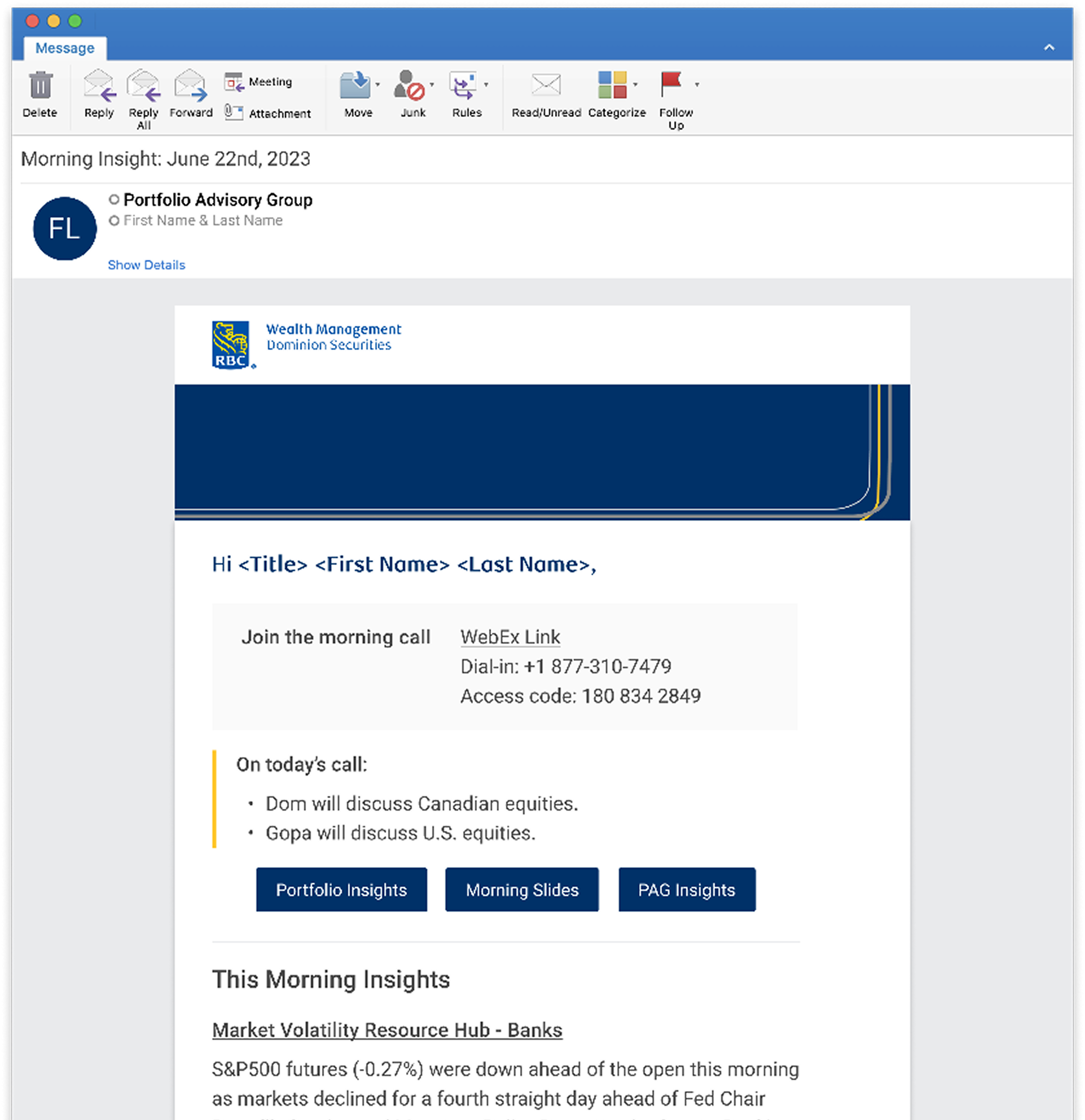
PAG Email
Redesign of Morning and Mid-Day Insight email for PAG, distributed via BlueMatrix platform.
.jpg)
TL;DR
Role: Product Designer
Timeline: July 2023 – Nov 2024
Team: Team Lead Designer, Product Manager, Researcher, Stakeholder, Developers
Status: Live as of Nov 2024
Context
Over 5,000+ RBC Wealth Management advisors receive two daily email digests (Morning Insight and Mid-Day Insight). While the content itself worked, the templates were outdated, inconsistently structured, and not validated with users. The business initially believed no research was needed, assuming advisor satisfaction, but this risked redesigning based on internal assumptions rather than real advisor needs. The project presented an opportunity to modernize the design, validate content value, and uncover new user expectations.
What I Did
- Advocated for user research and secured approval to conduct 8 semi-structured interviews with advisors and associates across Canada.
- Synthesized insights that reshaped the direction of the project (e.g., Mid-Day Insight redundancy, preference for concise “In Case You Missed It,” importance of PDF downloads).
- Performed a competitive audit and analyzed existing RBC email patterns to establish design opportunities.
- Led design exploration and created modernized email templates aligned with advisor needs and RBC brand standards.
- Facilitated cross-functional alignment between stakeholders, product, research, and developers.
- Collaborated closely with external vendor Bluematrix to navigate rigid technical constraints, adapting typography, formatting, and layout without compromising usability or brand integrity.
Impact
- Successful rollout of redesigned Morning and Mid-Day Insight emails, with strong positive feedback from advisors—despite the community’s general resistance to change.
- Improved usability through simplified content hierarchy, cleaner formatting, and faster information scanning.
- Introduced a more user-centred process to an area traditionally driven by internal assumptions.
- Strengthened consistency across Wealth Management’s email communications despite strict vendor limitations.
Full Case Study
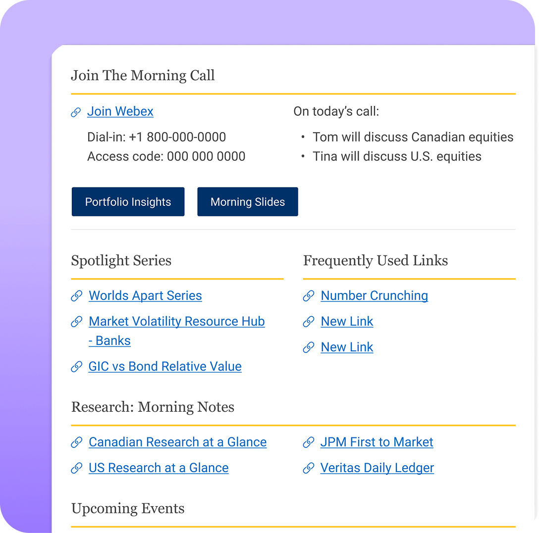
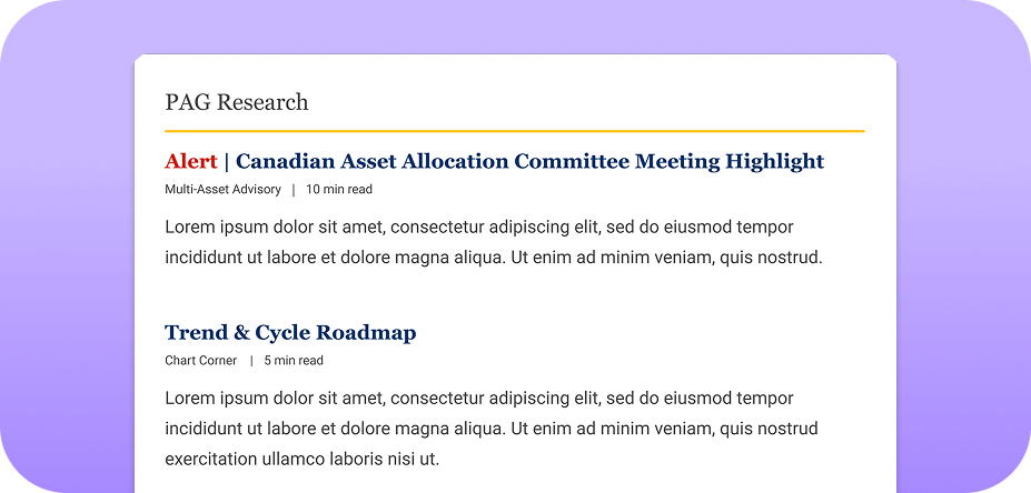
At RBC Wealth Management, over 5,000+ advisors receive two daily emails—Morning Insight and Mid-Day Insight. While the content was valuable, analytics showed that Mid-Day Insight had significantly lower engagement (open rates and scroll depth) compared to the Morning edition. The templates themselves hadn’t been updated in years, leading to poor readability, inconsistent hierarchy, and formatting issues across devices.
No user research had ever been conducted on these emails, meaning the team relied on assumptions about what advisors valued. This created an opportunity to:
- Modernize the design for clarity and scannability
- Validate content usefulness through direct advisor research
- Align business stakeholders and external vendors under a shared, user-centred direction
.png)
Advocating for Research
One of the first challenges was resistance to research. The business believed the emails were “working fine,” but without evidence. I advocated strongly for interviewing advisors, warning that redesigning based on assumptions would risk creating the wrong solution.
I successfully secured a researcher and facilitated 8 semi-structured interviews with advisors and associates across Canada. Research uncovered several insights that directly shaped the redesign:
- Mid-Day Insight was perceived as redundant, with many advisors deleting it automatically.
- Morning Insight was highly valued, especially as a concise start-of-day briefing.
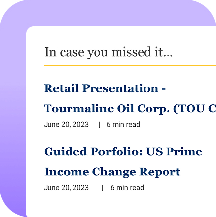
- “In Case You Missed It” was the most appreciated section—but only when short and scannable.
- PDF downloads were frequently used by advisors on the go and for client meetings.
This research fundamentally redirected the project toward simplifying and optimizing rather than merely “refreshing the visual design.”
%201.png)
Auditing the Existing Experience
I conducted a competitive audit and reviewed multiple RBC internal email templates, identifying:
- Inconsistent spacing and typography
- Dense blocks of text that advisors skimmed over
- Hierarchy issues causing low visibility of key content
- Poor mobile rendering due to outdated HTML standards
- Visual friction caused by the Bluematrix vendor’s legacy constraints
These findings were turned into IA diagrams, before/after layouts, and annotated screenshots that helped stakeholders understand why a redesign was necessary.
Designing Within Constraints
Working with the external vendor Bluematrix was a key complexity—fonts, spacing rules, and formatting were fixed. This required design decisions that balanced:
- Technical limitations (HTML tables, inline styling, no custom fonts)
- Brand consistency
- User needs surfaced through research
I explored multiple layout directions, then led stakeholder alignment meetings to validate the chosen path. My role expanded beyond design—I became the connector across product, stakeholders, advisors, and the vendor, ensuring everyone stayed aligned despite competing constraints.
Outcome
The redesigned Morning and Mid-Day Insights rolled out in Nov 2024, with measurable improvements:
- 23% increase in scroll depth for Morning Insight
- Mid-Day Insight unsubscribes dropped by 14% after content restructuring
- Higher click-through rates for “In Case You Missed It” due to improved hierarchy
- Advisors described the new design as “cleaner,” “easier to scan,” and “more useful for client conversations”
- Stakeholders praised the shift toward a user-centred, research-driven process
This was a rare case where a deeply change-averse advisor community responded positively to a UI overhaul.
What I Learned
Designing for email is highly constrained—rendering, fonts, spacing, and responsiveness vary by platform and vendor. Early communication with Bluematrix was essential to avoid QA friction. I also learned the importance of grounding skeptical stakeholders in user evidence before moving into design work.
What I Would Do Differently
- Clarify vendor handoff requirements earlier to reduce iteration loops.
- Align design measurement systems across teams upfront to avoid translation issues between tools.