More projects

.png)
RBC Wealth Wise
Strategic Redesign of an Institutional Research Platform.
.jpg)
TL;DR
Role: Product Designer
Timeline: Oct 2023 – Sept 2025
Team: Design Lead, User Researcher, Product Owner, Project Manager, Developers
Status: Live as of Sept 18th, 2025
Context:
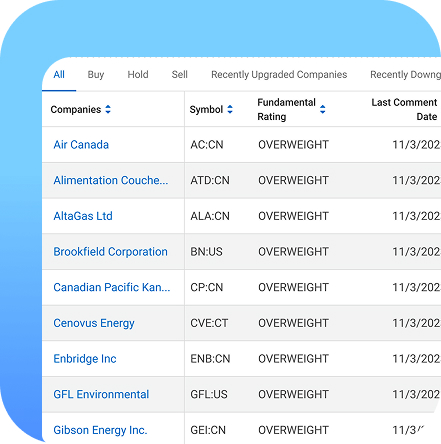
RBC Insights is a daily tool for advisors and clients to stay informed about markets and industry research. However, the platform struggled with poor search functionality, outdated design, inconsistent navigation, lack of responsiveness, and limited reporting capabilities, resulting in user frustration and inefficiency in content retrieval.
What I Did:
- Conducted a UX audit that revealed systemic usability issues overlooked by the team.
- Advocated for user research and secured alignment on a research-first direction.
- Mapped the site’s information architecture and highlighted navigation breakdowns.
- Redesigned search, navigation tiers, dashboards, and content workflows.
- Led usability testing, pilot testing, and co-design workshops.
- Shifted decision-making from SME assumptions → user evidence.
Impact:
- 2,124 advisors actively using Wealth Wise as of Dec 2025 (and growing).
- Global Search and Ratings became the most-used features post-launch.
- Significant reduction in navigation time and improved content discoverability.
- Strong qualitative and quantitative improvements in user workflow efficiency.
Full Case Study
Wealth Wise began in October 2023 with a small team: myself as the product designer, a design lead, a product owner, and developers. Early on, I noticed a major misalignment, the product team initially viewed the project as a visual refresh, but my UX audit revealed deeper structural issues in RBC Insights that were impacting advisor workflow.
Identifying the Real Problem
The audit uncovered specific pain points:
- Chronological content overload: Advisors spent excessive time digging through irrelevant reports.
- Limited search functionality: Users could only search by company or provider, not by topic, region, theme, or keyword.
- Overlap in navigation tiers: Poor information hierarchy created confusion and extra clicks.
- Workarounds due to platform deficiencies: Advisors subscribed to multiple providers to avoid missing reports, causing inbox fatigue.
.png)
I visualized these issues through information architecture mapping and user flow diagrams. These artifacts became persuasion tools that shifted team understanding: this wasn’t a makeover, it was a structural UX problem.
This moment marked a key influence point where I steered the team toward a user-centred, rather than assumption-driven, direction.
.png)
What the Research Uncovered
We conducted 1:1 semi-structured interviews (60 minutes each) with advisors, analysts, and PAG users. Research uncovered five core insights:
1. A desire for control, precision, and relevance
Users want powerful search and filtering to quickly refine content.
Requests included:
- Region filters
- Macro-theme keywords (e.g., inflation)
- Search within results
- Persistent global search
This directly shaped the advanced search redesign.
2. Wealth Wise was better, but still missing polish
Users liked the improved UI but still struggled with structure and consistency.
- Led to a cleaner IA and removal of overlapping categories.
3. Content is central to workflow
Reports support modelling, advisor Q&A, newsletters, and client updates.
- Informed the redesigned dashboard and content groupings.
4. Inconsistent structure caused friction
Themes, portfolios, and providers were not logically grouped.
- Drove the creation of a clearer, tiered navigation system.
5. Personalization is essential
Users wanted saved views, pinned tiles, custom dashboards, and the ability to hide irrelevant providers.
- Influenced the roadmap for customizable layouts and personalized feeds.
Together, these insights became the foundation for the new Wealth Wise experience and helped unify stakeholders around user needs.
.png)
Designing, Testing & Influencing Direction
After synthesizing insights, I created low- and mid-fidelity prototypes that redefined:
- Navigation tiers
- Global search
- Dashboard layout
- Content organization
- Provider, portfolio, and thematic structures
To maintain alignment, I facilitated:
- Design walkthroughs
- Storytelling sessions
- Side-by-side comparisons of Advisor Pain → Design Response
This is where I had the strongest influence:
I consistently redirected SME- and business-driven decisions back to user evidence, shifting the team’s decision-making culture.
Testing & Iteration
Usability testing returned a 78 SUS (above average). User sentiment confirmed value:
- “You’ve saved me quite a few clicks — I love it.”
- “Cleaner, faster, more intuitive.”
- “Being able to search within a report and email it directly? Game changer.”
Pilot testing revealed dashboard issues. I ran a workshop with users to co-design improvements, which led to:
- Clearer grouping
- Better scannability
- Reduced duplication
- A more modular layout
These refinements strengthened the final experience before handoff.
Outcomes (Quantitative + Qualitative)
As of Dec 3rd, 2025:
- 2,124 advisors actively using Wealth Wise
- Global Search & Ratings are the most-used features
- Reduced time to find content (measured through analytics)
- Improved search accuracy and content retrieval relevance
- Decreased reliance on email subscriptions
- Significant drop in navigation-related frustrations
- Improved workflow efficiency validated through follow-up feedback
The redesign improved clarity, speed, and usability, directly addressing core research insights.
Conclusion
Wealth Wise officially launched on September 18th, 2025. I will continue supporting the platform post-launch to ensure it scales with evolving user and business needs.
What I Learned
Individually
- No single framework fits all teams or projects.
- Communication and preparation create alignment and momentum.
As a Team
- Consistent user advocacy turned initial resistance into shared understanding.
- Design became the bridge connecting product, SMEs, and developers.
What I’d Do Differently
- Shape the process earlier rather than searching for the perfect framework.
- Lead alignment earlier to accelerate clarity and execution.

.jpg)

.jpg)